johnson & martin
Branding - Web Design - 2023

client
Johnson and Martin Case Management
brief
Case management firm, Johnson & Martin started in the summer of 2022. However, in a crowded market were struggling to gain traction.
They hadn't yet settled on any consistent branding leaving a clean slate to create a fresh, new take on what case management should look like.
outcome
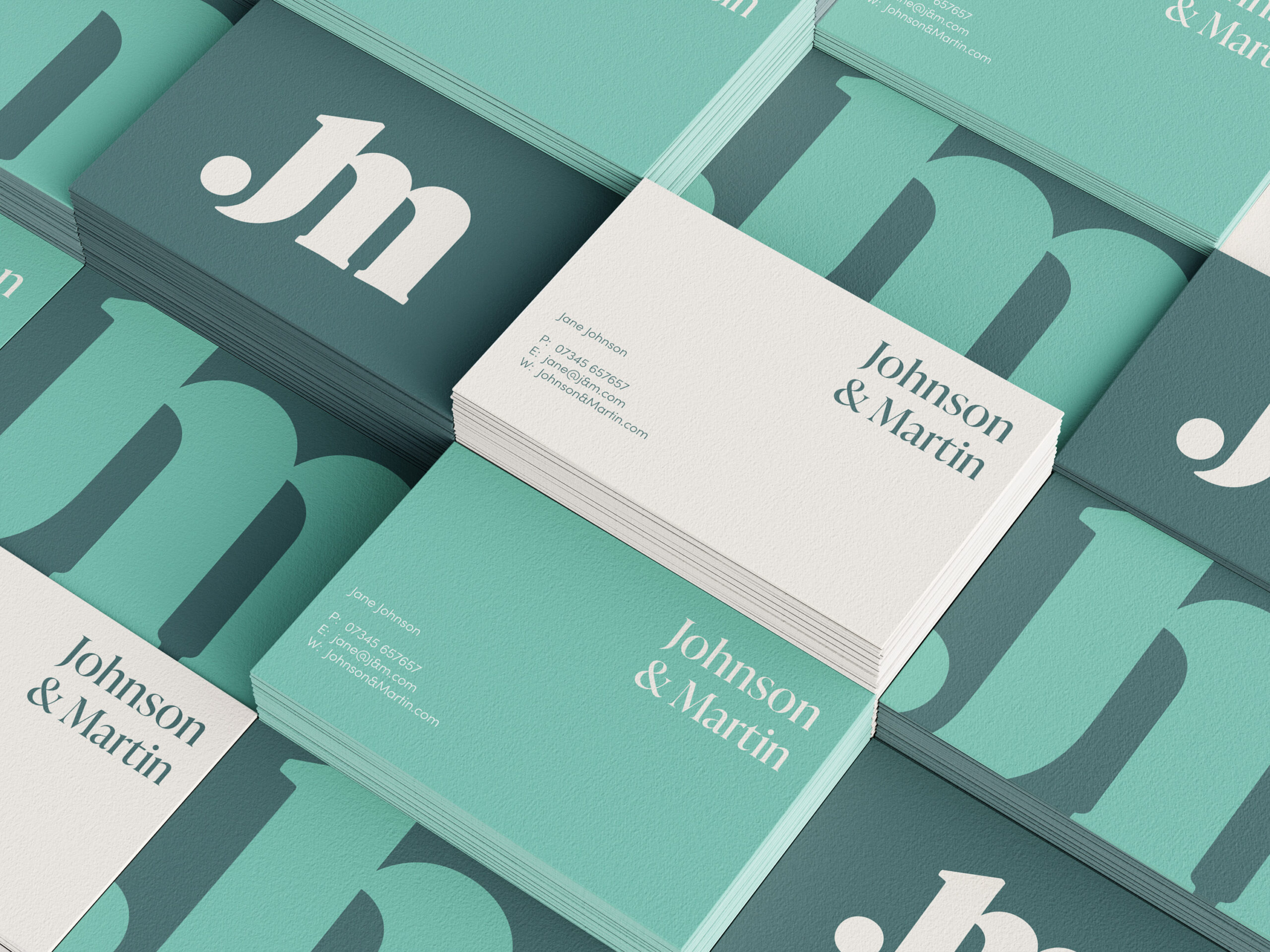
In a field full of medical jargon, tongue-twisting language and sanitised hospital-like websites I proposed to the client a different formula. Swapping the usual sans-serif typefaces of other case management firms, I created a brand that differentiates itself.
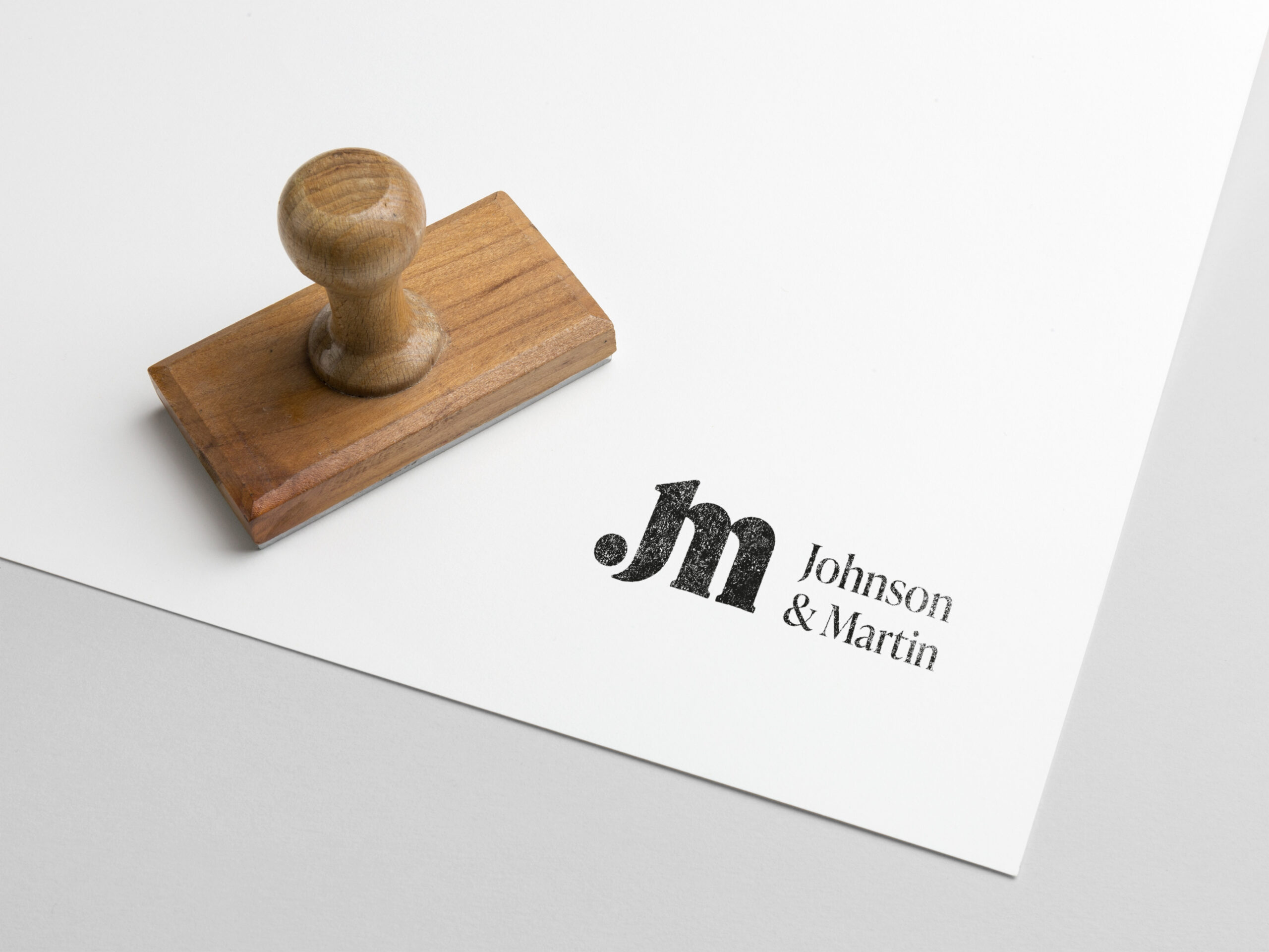
Johnson & Martin uses a delicate Serif typeface which reflects the experience and knowledge of the founders while retaining a sense of trust. Paired with a calming colour palette the brand remains approachable and open in its tone to allow the team to get the best possible treatment for its clients. This branding easily carried across to the website and online presence which i worked on alongside the clients web designer.
design solution
say hello!
Dan Dobson
BA Hons Graphic Design
Tel: +44 7721 395 360
Email: hello@dandobson.com
Instagram: @dandobson_
© Daniel Dobson 2023. Graphic Designer


